IMAGE 1
IMAGE 2 (SOLD)
IMAGE 3 (SOLD)
IMAGE 4 (SOLD)
IMAGE 5 (SOLD)
IMAGE 6 (SOLD)
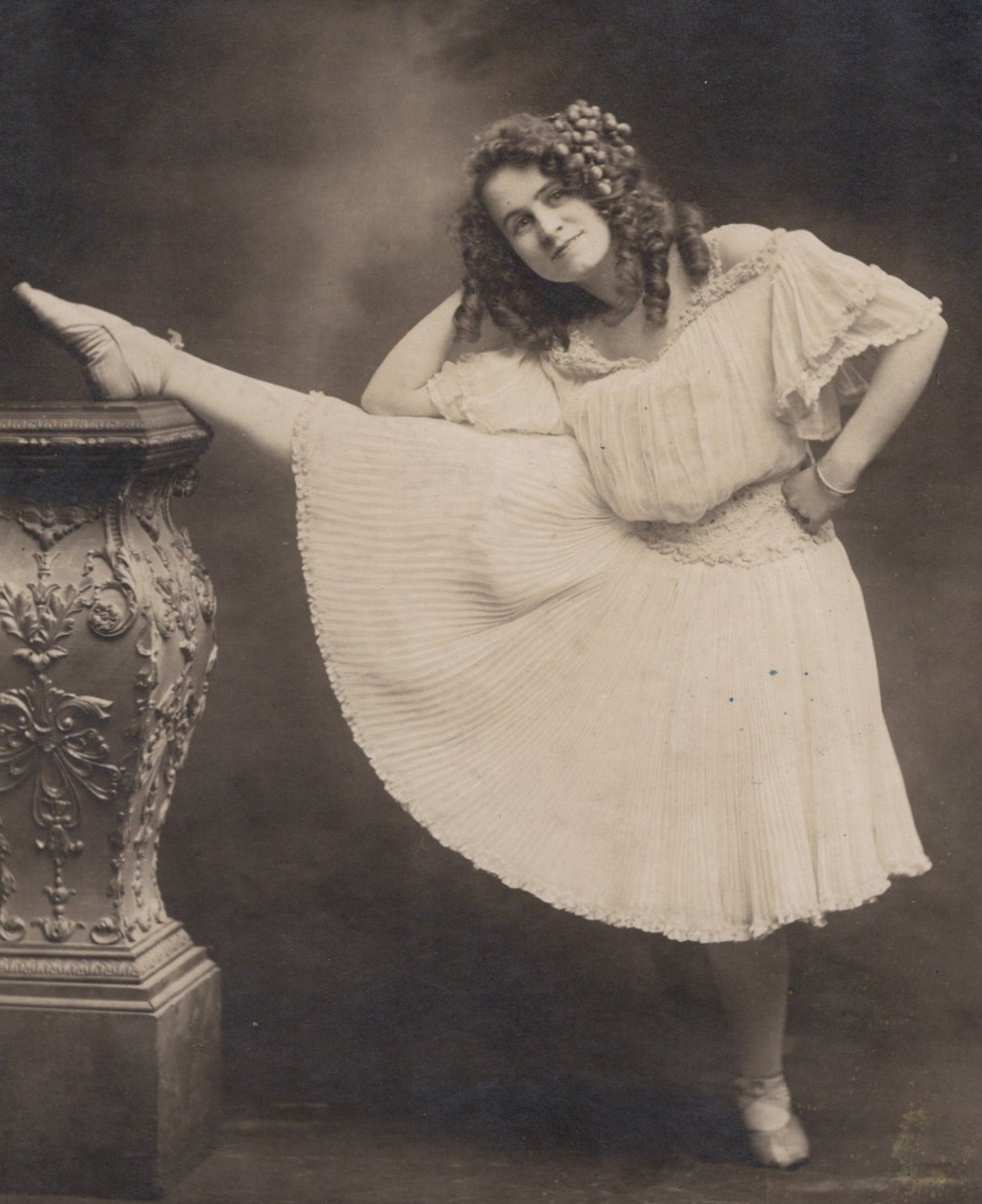
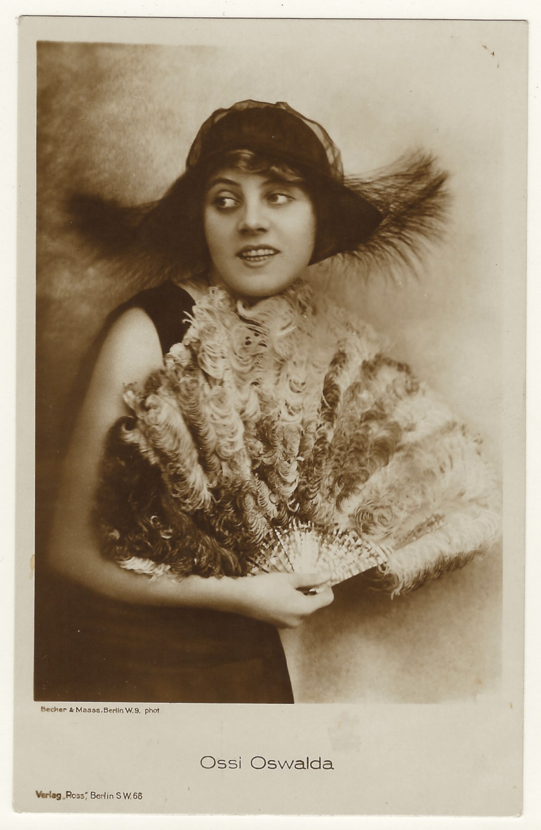
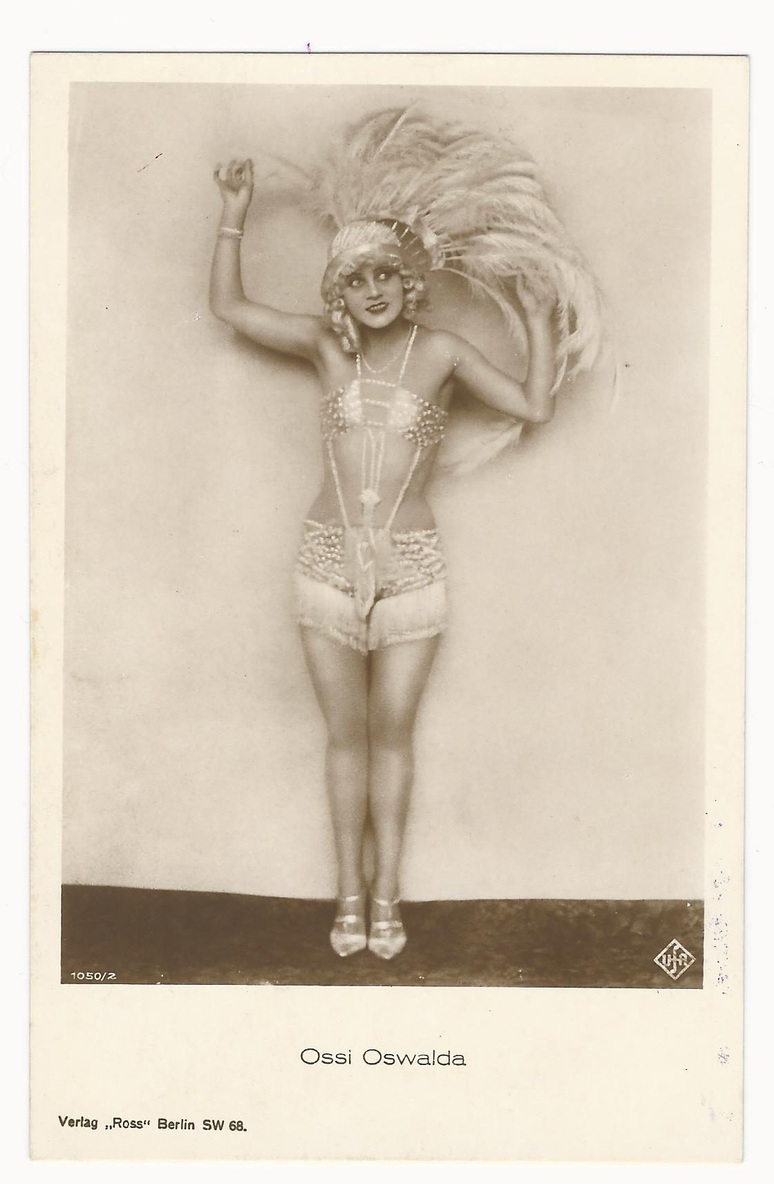
The beautiful actress seen in these vintage real photo postcarda is named Ossi Oswalda (1897-1947). She was born in Germany and appeared predominately in silent films. She was a leading lady, popular comedienne, dancer, and singer. Due to her popularity, she was known as “the German Mary Pickford”. Ossi began her career as a ballerina and she danced in a chorus line for a theater in Berlin. She made her film debute in “Night of Horrors” (1916) and was noticed by actor/screenwriter Hanns Kraly, who introduced her to director Ernst Lubitsch. Oswalda’s early career began with appearances in several Lubitsch films. In 1921, she and her husband started a film production company that produced four films over four years, all starring Miss Oswalda. After 1925, she was under contract to UFA, a German film company. After the transition to “talkies”, Oswalda joined the ranks of actresses and actors, who’s career took a nose dive. She only acted in two sound films. Her final screen appearance was in “The Star of Valencia”. She then began acting on the stage. She appeared in operettas in Germany and Vienna. When the National Socialists took power in Germany, she emigrated to Prague with her “Jewish life partner”, Julius Aubenberg. In 1943, she wrote a story for a Czechoslovakian film. In summarizing Ossi’s career, the IMDb credits her with 51 film appearances, producing 5 films, and 1 screen writing credit. It is reported that she frequently played child-like spoiled women. She appeared in drag in at least one film. Oswalda’s first marriage (1919-1925) was to a Hungarian baron. After her divorce, the actress began a highly publicized romantic relationship with Crown Prince Willhelm (1882-1951). Simultaneously, the actress Lily Damita, was having an affair with the Prince’s son. The royal family put a kibosh to both “inappropriate” relationships. In 1947, she died in Prague at age 48, bankrupt and suffering from multiple health problems.
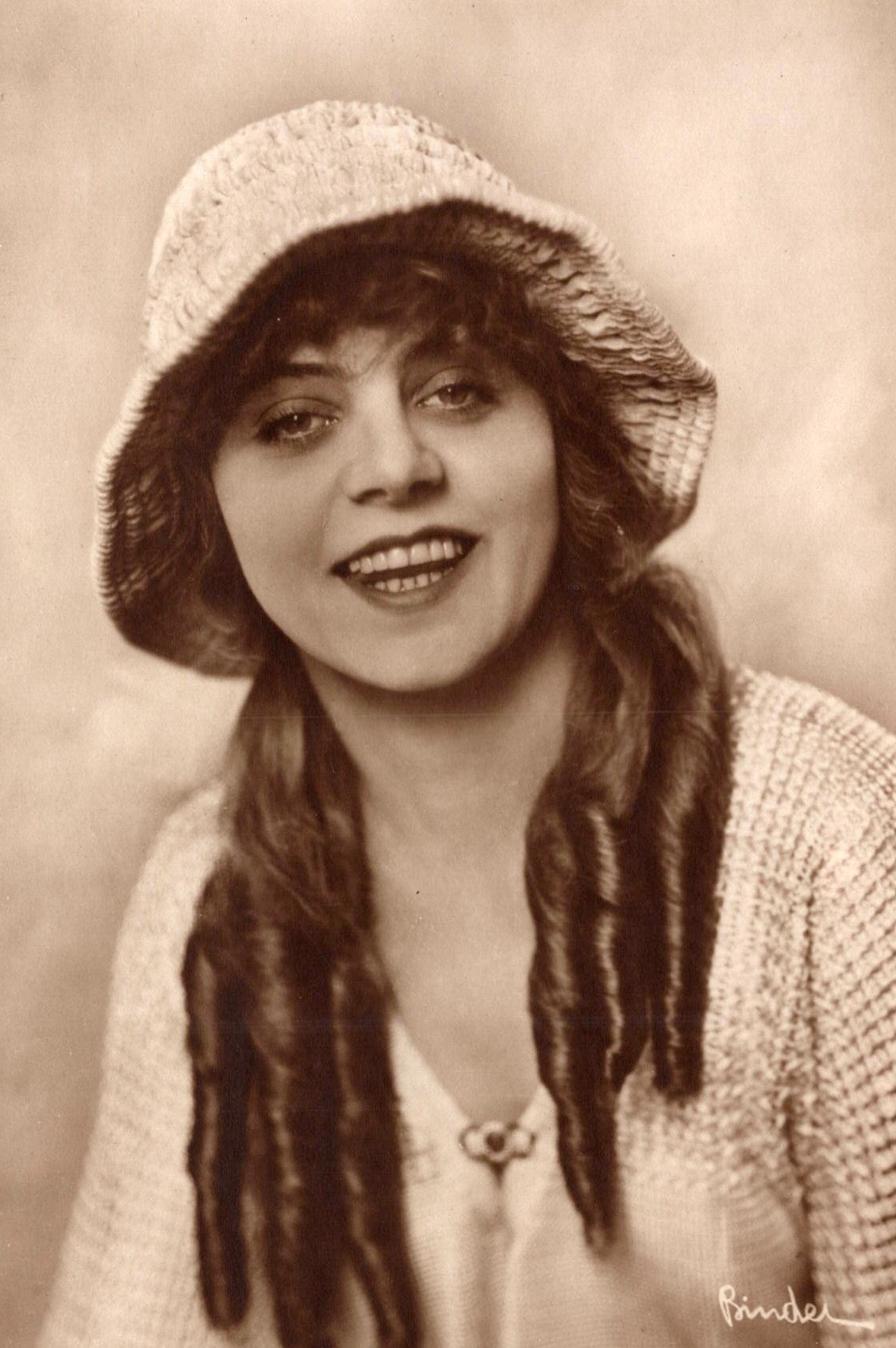
Image 1 : This German real photo postcard is published by Ross Verlag soemetime between 1919 and 1924. The photograph of Miss Oswalda was taken by Becker & Maass of Berlin. Note her pretty hat and fan. Hopefully, she wasn’t allergic to feathers. Oswalda was young when this photograph was taken. She was beautiful and no older than 27 years of age.
Image 2 : features Miss Oswalda in a very skimpy costume. Her feathered hat is quite showy . She has a wonderful smile and pretty eyes. This risque postcard was part of a series (no. 1050/2) and published by Ross Verlag of Berlin, Germany. The logo of UFA, a German film company, appears on the lower right hand corner of the postcard. The reverse of the postcard reveals that that the photographer is Strobl J. Nandor of Budapest, Hungary. (SOLD)
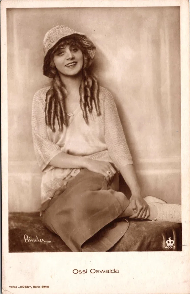
Image 3 is a German real photo postcard that was published by Ross Verlag. Miss Oswalda’s photo was taken by celebrity photographer Alex Binder. (SOLD)
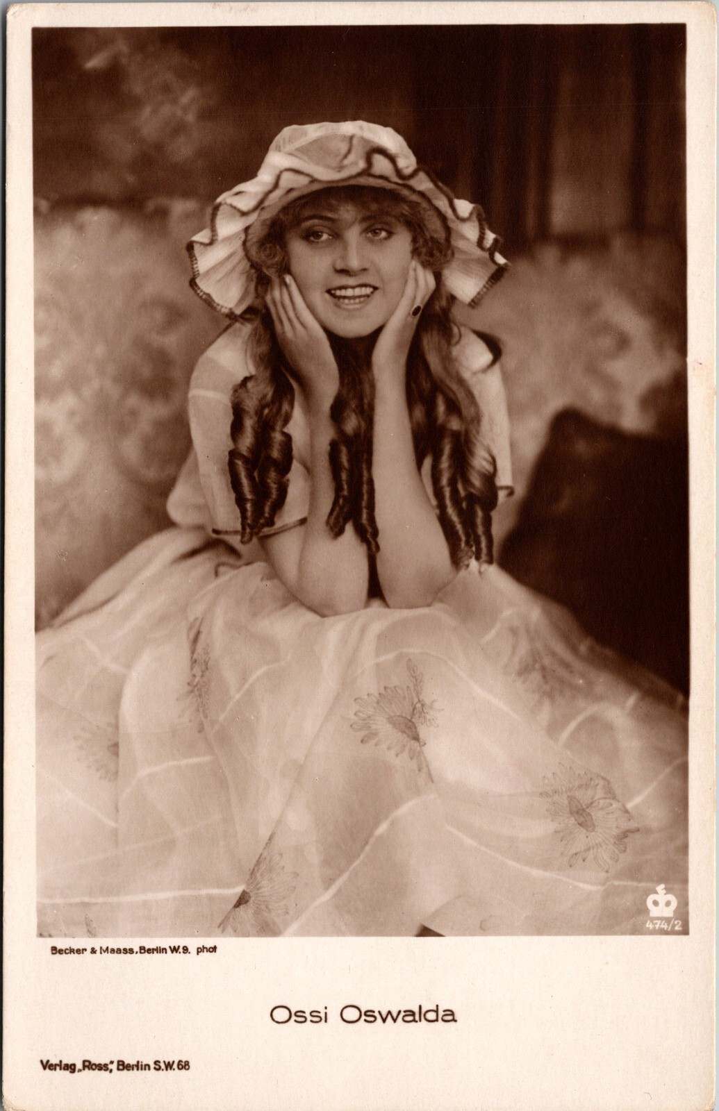
Image 4 captures Miss Oswalda looking amused. She is flashing a wonderful smile. This postcard was published by Ross Verlag of Berlin, Germany (no.474/2). (SOLD)
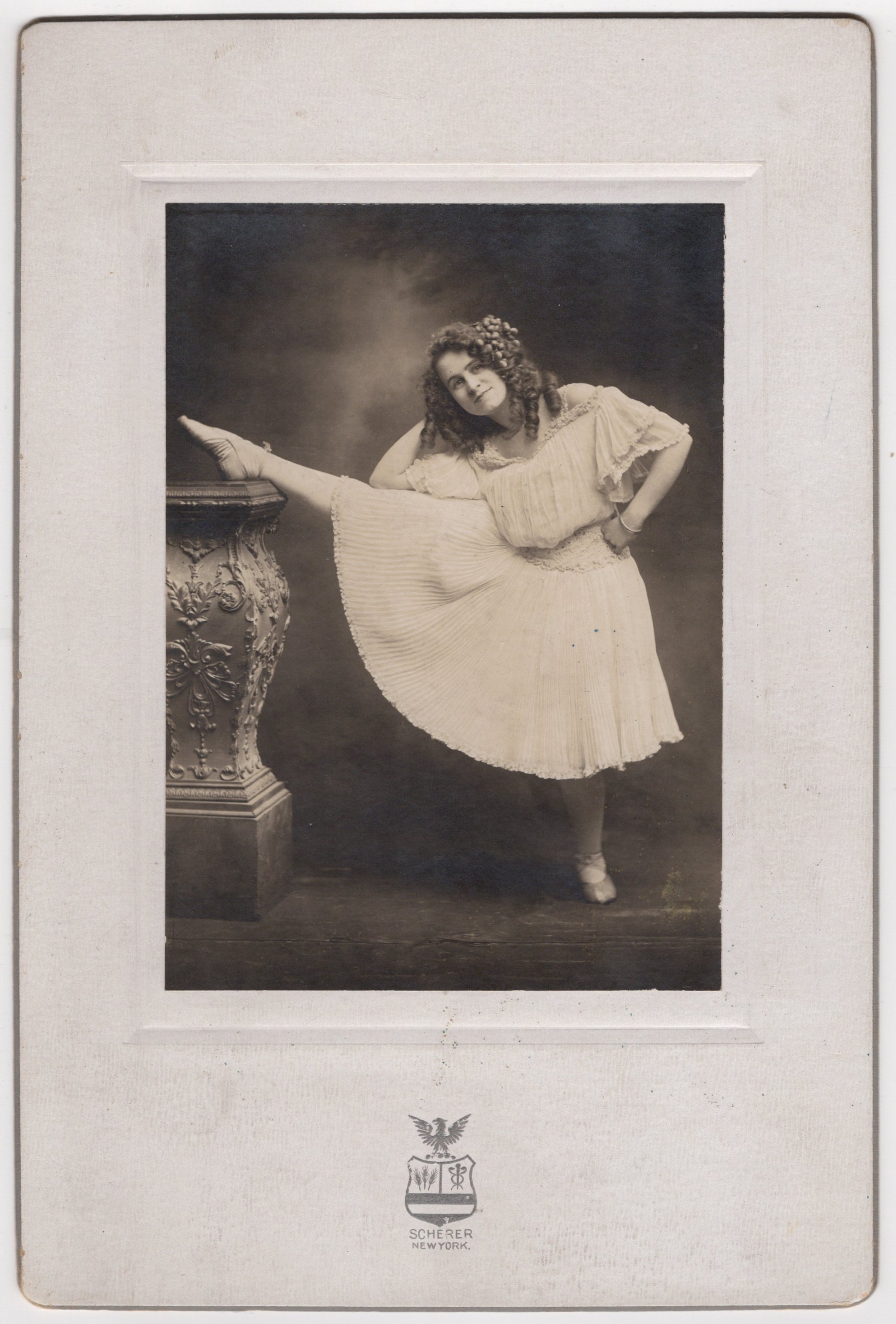
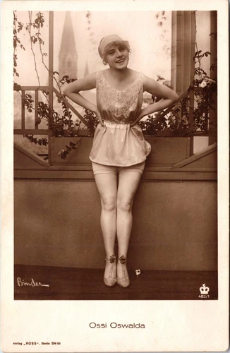
Image 5 captures Miss Oswalda in a provocative pose. She is wearing a short skirt resulting in quite a leggy photo. Posing her with her hands on her hips was aimed at being suggestive. This risque postcard was published by Ross Verlag of Berlin, Germany (no.483/1). The photographer of this portrait of Oswalda was celebrity photographer Alex Binder. (SOLD)
Image 6 is published by Ross Verlag as part of a series (No.483/2). Miss Oswalda’s photo was taken by celebrity photographer Alex Binder. (SOLD)